|
Not too long ago, I got vaporlocked
into the new site redesign coming out in 2010. Lost track of time, next
thing I know it's 8PM. But since the website design is actually done, I
figured I'd give you all a sneak preview of the site design, and give you a
little rundown of what my site looked like over the years. Clicking on the
images will get you a full sized screen shot of the old sites.
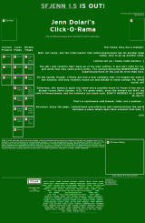 1998:
I've actually had a website since 1996, which began, actually, as a fan page.
I was kind of popular back in the day as a woman who played Mortal Kombat who
talked on Usenet. For some reason, this made me insanely popular. Go
figure. 1998:
I've actually had a website since 1996, which began, actually, as a fan page.
I was kind of popular back in the day as a woman who played Mortal Kombat who
talked on Usenet. For some reason, this made me insanely popular. Go
figure.
 While
I don't have archives going back this far (the earliest is 2001), and it seems
Archive.Org didn't have any of the images for my first site, I do still have one
image from that first site. That green skull is the oldest file still in
use on this website, thirteen years old. While
I don't have archives going back this far (the earliest is 2001), and it seems
Archive.Org didn't have any of the images for my first site, I do still have one
image from that first site. That green skull is the oldest file still in
use on this website, thirteen years old.
There was a running theme for a long time (and still
kinda is a running theme) about having Chun Li on my homepage, and an animated
gif of her was on the top left of the page. I'd designed the site in a kind of Highway Sign motif,
Highway Gothic font on Green.
The icons streaming down on the left were the
beginnings of the "Click-O-Rama,"
a list of links I used to relieve boredom at work. If you look at the top
left icon, you'll see a link to an upcoming comic called Closetspace. :)
The page had a hand drawn image of a Victrola, the words "Coming Soon" and an
illegal RealAudio file of Suzanne Vega's "As Girls Go." Obligatory webring
down there, too. At the very bottom you'll find my old Monster Sig, which
I used on Usenet when someone said Girl Fighters sucked.
  2001:
By 2000, the Closetspace thing had fizzled, my life in Pennsylvania was a mess,
and we decided to move to Austin. Things got so good in the dotcom boom
that I picked up Dolari.Org, and moved my webstie to that. By now the
Mortal Kombat phase had ended (although I still had a picture of Chun Li on the
top left. I'd gone for a more Blue-and-Gold design, but sadly, I don't
have the images for that version of the page anymore. It still wasn't much
more than a glorified blog that updated monthly. 2001:
By 2000, the Closetspace thing had fizzled, my life in Pennsylvania was a mess,
and we decided to move to Austin. Things got so good in the dotcom boom
that I picked up Dolari.Org, and moved my webstie to that. By now the
Mortal Kombat phase had ended (although I still had a picture of Chun Li on the
top left. I'd gone for a more Blue-and-Gold design, but sadly, I don't
have the images for that version of the page anymore. It still wasn't much
more than a glorified blog that updated monthly.
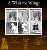
In late 2001, I was laid off and spent the time between
looking for work by doodling comics.
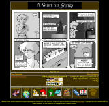
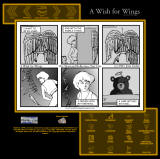
After a brainstorm I sat down and began work on
A Wish for Wings, which ran over
Keenspace/Comicgenesis for a good number of years. I rather like this
design (the background was all watermarked, so it really didn't cut off like
this image shows), which I called Dolari Special Dark, after the chocolate. :)
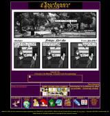
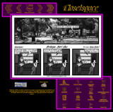
I do have what looks like a prototype Closetspace page
in that same theme, but never got much beyond a purple gradient background, it
seems.
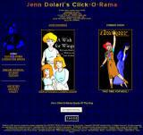 2002:
In 2002, I redesigned the site a bit, so that the blue was in a pattern instead
of a gradient like it was before. Also, I had a nice pic of Chun Li to use
up in the corner. This was the first page to herald Closetspace, replacing
the Never Used Blog format. 2002:
In 2002, I redesigned the site a bit, so that the blue was in a pattern instead
of a gradient like it was before. Also, I had a nice pic of Chun Li to use
up in the corner. This was the first page to herald Closetspace, replacing
the Never Used Blog format.
Eagle eyed viewers might notice that AWFW says "by
Jenni Bravo, written by Jenn Dolari." At the time, Jenni had offered to
continue AWFW for me when my computer died in late 2001. While we never
did start the joint venture, I pushed it for a while.
It's also the first to break my page into themes.
If you clicked on the Click-O-rama, the theme stayed blue with Chun Li, but
clicking on the second set of links, the theme changed to purple with a picture
of Shuriken (10 grotzits says you have no idea who she is, and 20 that you
don't' know what a grotzit is), and the third page was red with a pic of
Supergirl. Having specific colors per section is something that's carried
over to this day with the pages (Closetspace in purple, AWFW in gold, Wishworld in silver and everything
else is in red).
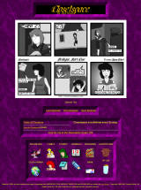
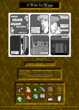
  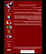 Midway
through the year, I began playing with website themes, and came across one I
really liked. It...um...well...it didn't go so well with all two of the
readers I had at the time. Midway
through the year, I began playing with website themes, and came across one I
really liked. It...um...well...it didn't go so well with all two of the
readers I had at the time.
Frankly, I don't know what I was thinking with the
interlaced lines. The red was particularly eye hurting, and after a week
or two, I dimmed it down a bit. The interlacing was also used in AWFW and
CS (CS premiered with this design), which didn't hurt near as many eyes, but, my god, was still tacky as all get
out. You'll notice I'd moved on from Chun Li, replacing her with Nakoruru
from Samurai Shodown. The icons from the old 1998 site were brought back,
but my GOD the 16-colors-per-icon thing looked horrible.
   It
didn't take long, before the complaints on the interlaced sites came in (WebTV
users especiall HATED it) so I came up with new idea using an old Windows 3.11
wallpaper in late 2002 (those same marble texture is over there on the left). It
didn't take long, before the complaints on the interlaced sites came in (WebTV
users especiall HATED it) so I came up with new idea using an old Windows 3.11
wallpaper in late 2002 (those same marble texture is over there on the left).
The front page was ground down to the bare essentials, taking you to the comics
or the Click-O-Rama. Most everything else was simply pared down to
nothing, since the only thing that mattered at the time were the
rapidly-gaining-popularity comics. I'd even stopped updating the Click-O-Rama
at the time. I really should update that thing more.
I'd always liked a lot of the menu designs you saw in
the Final Fantasy Movie and in things like the original XBox dashboard. I
attempted to emulate it in the main page.
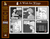
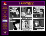
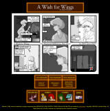 2003: I was
still working on the glowy graphics when I redesigned the A Wish for Wings page
for 2003. It was a neat effect, but not what I wanted. Still, the
neon stayed on AWFW for quite some time, while Closetspace retained the marble
look. 2003: I was
still working on the glowy graphics when I redesigned the A Wish for Wings page
for 2003. It was a neat effect, but not what I wanted. Still, the
neon stayed on AWFW for quite some time, while Closetspace retained the marble
look.
If you look carefully, you'll notice, the Click-O-Rama
icon is gone. It's tough to compilate and keep current, and running two
comics a week was kinda nervewracking It came back after a few years in
2006.
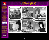
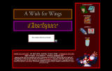   2005:
With the Click-O-Rama gone, the front page got redesigned to feature more of the
subpages of the site, which used to be on the Click-O-Rama page. The first
Cube
quotes began showing up around this time as well. 2005:
With the Click-O-Rama gone, the front page got redesigned to feature more of the
subpages of the site, which used to be on the Click-O-Rama page. The first
Cube
quotes began showing up around this time as well.
 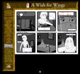 At
the same time, the first release of the comics on CD-ROM got me into redesigning
the website into a more "LCARS"
design. The icons dissapeared in favor of text links and were moved to the
top left so that readers could click through the comics without moving the
mouse. This 2005 design has lasted to this day, albeit replacing the neon
with a marble texture for the comic sites in 2007. At
the same time, the first release of the comics on CD-ROM got me into redesigning
the website into a more "LCARS"
design. The icons dissapeared in favor of text links and were moved to the
top left so that readers could click through the comics without moving the
mouse. This 2005 design has lasted to this day, albeit replacing the neon
with a marble texture for the comic sites in 2007.
 In late 2005, I
changed the front page on a lark to a Windows 3.11 derived landing page, which
has stayed there (with an increasing number of icons over the years). One
of the first people to see the page came from Microsoft.com. As it's been
my front page for almost five years, must not have been a lawyer. Knock on
wood. In late 2005, I
changed the front page on a lark to a Windows 3.11 derived landing page, which
has stayed there (with an increasing number of icons over the years). One
of the first people to see the page came from Microsoft.com. As it's been
my front page for almost five years, must not have been a lawyer. Knock on
wood.
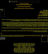
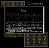
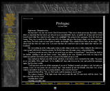 2009: With a
new section, Wishworld, being totally prose, it's design needed some special
tweaking to work with the design I gave it. Keeping to the original
Chun-Li color theme from way back when, I made the new site dark grey, which is
one of her costume colors in Super Street Fighter II Turbo. 2009: With a
new section, Wishworld, being totally prose, it's design needed some special
tweaking to work with the design I gave it. Keeping to the original
Chun-Li color theme from way back when, I made the new site dark grey, which is
one of her costume colors in Super Street Fighter II Turbo.
Real quick, the color themes are still all Chun-Li
based. Chun-Li's blue qipao will be used for an upcoming story called
Manpower, red is for the Click-O-Rama, Grey for Wishworld, Yellow/Gold for AWFW,
Green for the upcoming Book of Xand, Purple for Closetspace. White and
Mint Green haven't been used yet (maybe for the SFJenn game) when I get around
to making those pages.
An IFrame was added instead of a comic, for easy
scrolling without needing to scroll the whole page. After some folks
complained that they didn't like reading white text on black screens, I added a
"Reverse colors" link to flip the page colors. Seriously, though,
black on white hurts my eyes...but if y'all wannit.
The sites haven't changed much in five years, so I felt
it was time for a site-wide-redesign. That and the "Your site is so
retro!" comments. So what does the far off future of 2010 hold?
Where do we go from here?
2023? Coming soon...
|