|
|
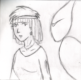 Normally, what I do is
divide up an 11x17 sheet of paper from my sketchbook into
six segments one for each panel of a comic. Using a
mechanical pencil, I try to draw what I see straight onto paper, but occasionally you'll see me use the "Ball and cylinder" method of
drawing. Normally, what I do is
divide up an 11x17 sheet of paper from my sketchbook into
six segments one for each panel of a comic. Using a
mechanical pencil, I try to draw what I see straight onto paper, but occasionally you'll see me use the "Ball and cylinder" method of
drawing.
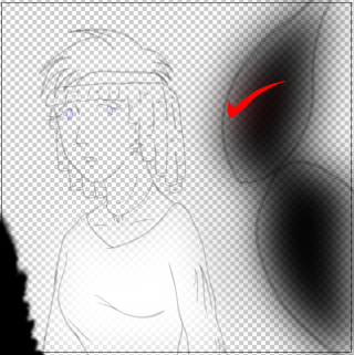
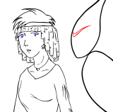  After that, I scan the image
as a grayscale image at 300 DPI. A
regular panel of paper will scan in at about 1700x1700 pixels. Once all
the penciling is done for an episode, I'll ink it in Adobe Illustrator as a
separate layer.
Illustrator is GREAT for saving your artwork as vector graphics while still
keeping a small file size, which means you can get print quality work
without too big a hit on disk space. Occasionally, you'll see an "X"
marking out areas of the comic. Those Xs usually mean
two things: If it's an X without an arrow, it usually means "This
area will be black." If it's an X with an arrow, it usually means
"delete a piece of detail here." Once the inking is done, I'll
remove the pencil later, leaving me with nice clean ink lines. After that, I scan the image
as a grayscale image at 300 DPI. A
regular panel of paper will scan in at about 1700x1700 pixels. Once all
the penciling is done for an episode, I'll ink it in Adobe Illustrator as a
separate layer.
Illustrator is GREAT for saving your artwork as vector graphics while still
keeping a small file size, which means you can get print quality work
without too big a hit on disk space. Occasionally, you'll see an "X"
marking out areas of the comic. Those Xs usually mean
two things: If it's an X without an arrow, it usually means "This
area will be black." If it's an X with an arrow, it usually means
"delete a piece of detail here." Once the inking is done, I'll
remove the pencil later, leaving me with nice clean ink lines.
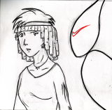
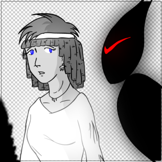
  Still
in Illustrator, I'll duplicate the inks on another layer behind the
actual inks and turn it into a "LivePaint" group, which marks out
zones where I can broadly color in large swaths of the image.
Once I've got the basic colors down, I mark out areas for lightening
or darkening the image, add them to the live paint group, and color
them the appropriate shades. Once that's all done, I remove
the strokes from the color layer, and with the inks layer showing,
you get a nice, but plain, cel shaded image. Still
in Illustrator, I'll duplicate the inks on another layer behind the
actual inks and turn it into a "LivePaint" group, which marks out
zones where I can broadly color in large swaths of the image.
Once I've got the basic colors down, I mark out areas for lightening
or darkening the image, add them to the live paint group, and color
them the appropriate shades. Once that's all done, I remove
the strokes from the color layer, and with the inks layer showing,
you get a nice, but plain, cel shaded image.
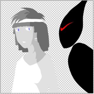
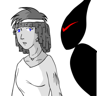
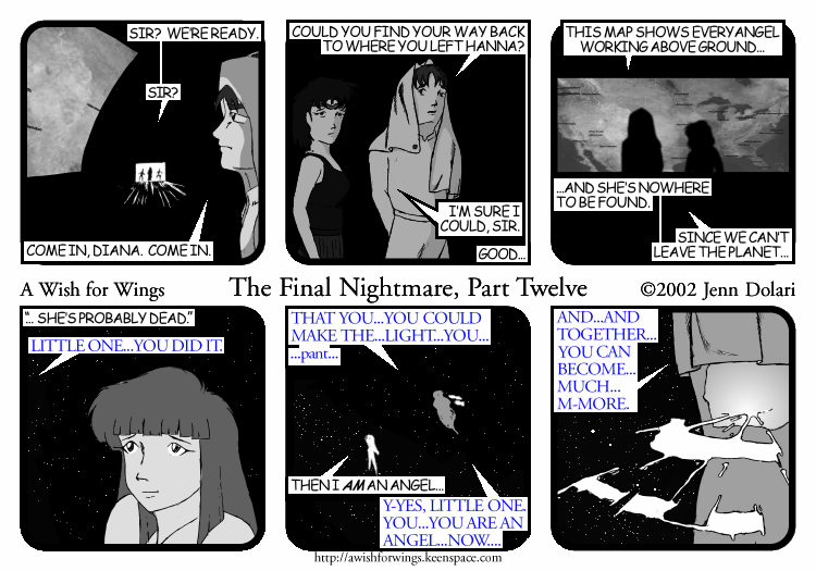
  The "SFX" portion of
the image is where I do any filters
and effects, again on a separate layer. In this case, there's a
Gaussian Blur applied to Cassia's robe, and to the Shadow, as well as
what will be a burn mark on the back wall. When the colors/inks
are added back in, the robe will glow, and the shadow will "ooze" black. The "SFX" portion of
the image is where I do any filters
and effects, again on a separate layer. In this case, there's a
Gaussian Blur applied to Cassia's robe, and to the Shadow, as well as
what will be a burn mark on the back wall. When the colors/inks
are added back in, the robe will glow, and the shadow will "ooze" black.
It isn't perfect, though - Gaussian blurs tend
to washout details underneath, so a copy of the ink layer is added in at
20% transparency. This will allow the black lines on Cassia's robe
to come out. The Shadow's eye is copied as well, to make it stand
out.
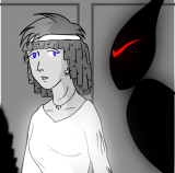 Finally,
I'll add in the background layers, in this case, just a plain wall.
I'll also layer stuff
in like the map you see here, or more intricate backgrounds (The gazebo
for Closetspace #13 is
one example). Finally,
I'll add in the background layers, in this case, just a plain wall.
I'll also layer stuff
in like the map you see here, or more intricate backgrounds (The gazebo
for Closetspace #13 is
one example).
 This poor template, it's been so
twisted and turned and morphed. Originally, it was created in
Pagemaker way back in 2001, then converted to Quark Xpress, and now it still
exists as an inDesign template. This poor template, it's been so
twisted and turned and morphed. Originally, it was created in
Pagemaker way back in 2001, then converted to Quark Xpress, and now it still
exists as an inDesign template.
I get a lot of flak for staying with this
template when there are more dynamic compic pages out there now.
The reason I stay with it? Well, back in 2001, I didn't have
much screen space to make a comic, and horizontal three panel strips
were the norm. Technology has gotten better, as has bandwidth,
but I don't like changing styles in the middle of the run.
Once AWFW or CS ends, I plan to go to a more dynamic looking page
for my next comic.
 I assemble the comic in inDesign, pasting in the individual images, and creating text boxes.
Once it's all done, it gets saved as a massively huge EPS for possible
printing down the line (which you can
see here,
then sized down to 750x525 and posted up for you all to throw tomatoes at.
:) I assemble the comic in inDesign, pasting in the individual images, and creating text boxes.
Once it's all done, it gets saved as a massively huge EPS for possible
printing down the line (which you can
see here,
then sized down to 750x525 and posted up for you all to throw tomatoes at.
:) |
![[Closetspace]](../../images/GlobalIconClosetspace.png "[Closetspace]")
|
 |
![[SFJenn]](../../images/GlobalIconSFJenn.png "[SFJenn]")
|
|
[Wishworld]
|
[The Book of Xand]
|
[The Girl in the Mirror]
|
|
[The Long Road Home]
|
[Manpower] |
[The Many Lives
of Genevieve] |
| [Voices of
Authority] |
[Voyage of the
Alexandria |
![[Facebook]](../../images/GlobalIconFacebook.png "[Facebook]") |
![[Livejournal]](../../images/GlobalIconLivejournal.png "[Livejournal]") |
![[Mastodon]](../../images/GlobalIconMastodon.png "[Mastodon]") |
![[dreamWIDTH]](../../images/GlobalIconDreamwidth.png "[dreamWIDTH]") |
![[Twitter]](../../images/GlobalIconTwitter.png "[Twitter]") |
![[DeviantArt]](../../images/GlobalIconDeviantArt.png "[DeviantArt]") |
![[Instagram]](../../images/GlobalIconInstagram.png "[Instagram]") |
![[Jenn's Picture Pile]](../../images/GlobalIconJennsPicturePile.png "[Jenn's Picture Pile]") |
![[Twitch]](../../images/GlobalIconTwitch.png "[Twitch]") |
![[YouTube]](../../images/GlobalIconYouTube.png "[YouTube]") |
![[Links]](../../images/GlobalIconLinks.png "[Links]") |
![[EMail]](../../images/GlobalIconEMail.png "[EMail]") |
 |
|
